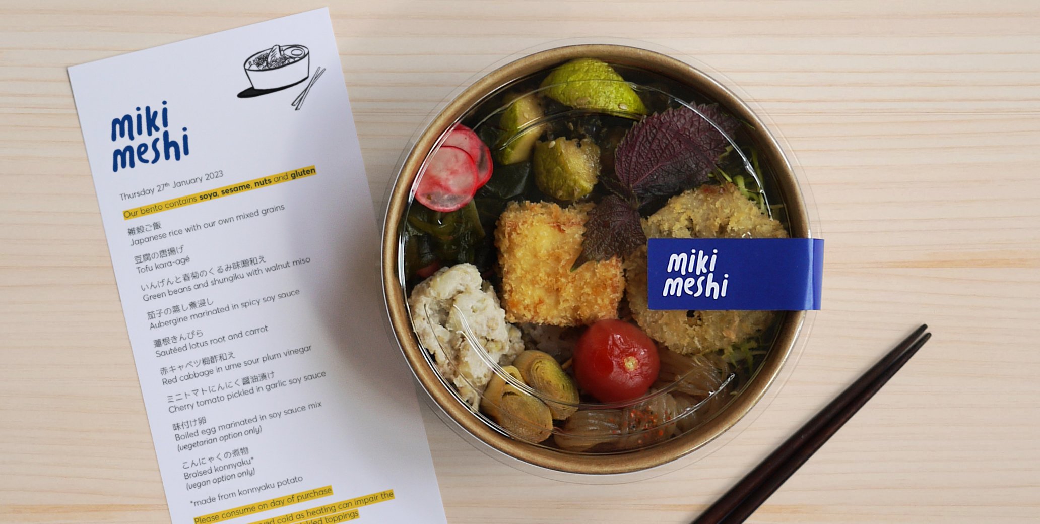
miki meshi
Brand Identity & Stationery
miki meshi is a group of Japanese mums who love cooking and eating; brought together by their appetite to share the home-cooked food they grew up on. miki (a girl’s name in Japan) comes from a combination of the founders’ names, whilst meshi loosely translates to ‘grub’.
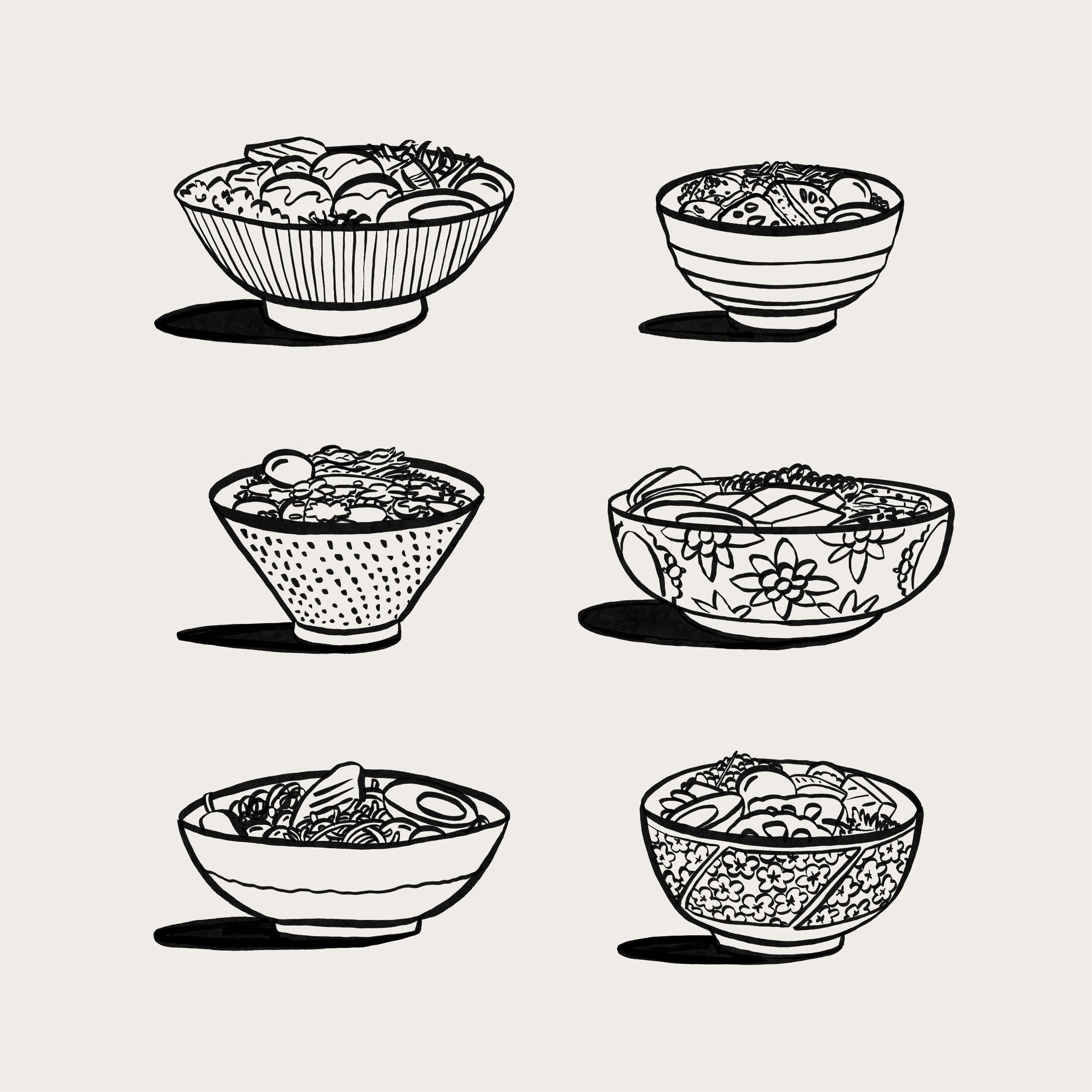
It’s this casual familiarity that inspired the logo, like a handwritten note that’s been bundled into your bento box before heading off to work/school. The other brand ingredients follow suit, taking cue from parts of Japanese culture without veering into the clichéd. Simple brush pen style illustrations adds a touch of playfulness and nod to the artistry of calligraphy, and the polka dot pattern, ‘mame shibori’, is a symbol of good health and long life. Incorporating it into the identity felt like a natural fit with their ethos of making healthy, home-cooked food.