Design & Branding Studio of Matt Gray

Norfolk & Delancey

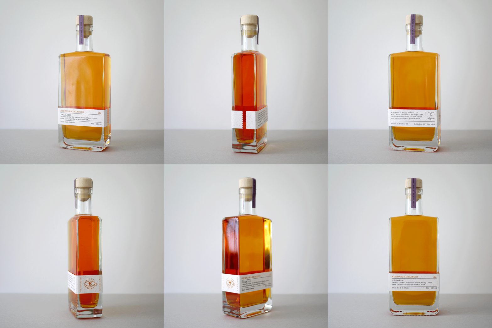
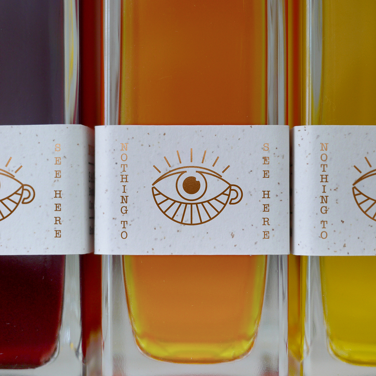
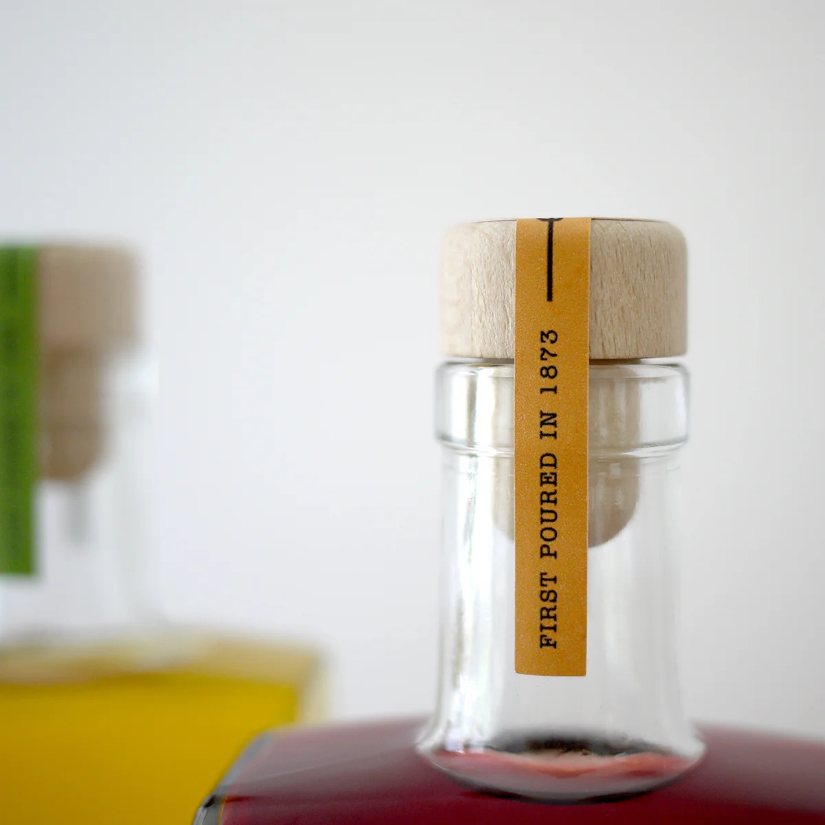
After a trip to New York, I was stirred to expand my knowledge of whisky-based cocktails. Usually the traditionalist, I prefer my whisky with a drop of water and nothing more. Occasionally having an Old Fashioned or Whisky Mac. Whilst enjoying a bit of downtime, I created a range honouring what have come to be my top five. The name is a nod to one of New York’s infamous speakeasies, The Back of Ratner’s, with the rest of the identity following suit, from the hardback book case and ‘all seeing tea cup’ to the simple typewriter typography.

Norfolk&Delancey-Range.jpg

Norfolk & Delancey
Whisky Cocktails

Brand Identity & Packaging (Personal Project)

After a trip to New York, I was stirred to expand my repertoire of whisky-based cocktails. Usually the traditionalist, I like my whisky with a drop of water and nothing more. Occasionally having an Old Fashioned or Whisky Mac. Whilst enjoying a bit of downtime, I created a range honouring what have come to be my top five. The name is a nod to one of New York’s infamous speakeasies, The Back of Ratner’s, with the identity and packaging design taking inspiration from the era.

Norfolk&Delancey-Book-Shelf.jpg
Norfolk&Delancey-Books-Lineup.jpg
Norfolk&Delancey-Book-Bottle.jpg
Norfolk&Delancey-360.gif
Norfolk&Delancey-Eyes.jpg
Norfolk&Delancey-Dramble-Label.jpg
Norfolk&Delancey-Tamper-Front.jpg
Norfolk&Delancey-Tamper-Top.jpg
Norfolk&Delancey-Cards.jpg